Pretty Isn’t a Strategy: Why Beautiful Brands Still Get Ignored
How distinctive positioning, visual identity, and brand strategy turn aesthetics into commercial value
There has never been a better time to make something look good.
There has also never been a harder time to make something look different.
Open Instagram and you’ll find thousands of beautifully photographed products. Boutique hotels have the same neutral palettes. Skincare brands have the same minimal packaging. Luxury services have the same elegant serif typography. Fashion labels borrow the same editorial photography.
Everything looks polished.
And increasingly, everything looks the same.
That creates a problem for brands.
Because beautiful branding can get you noticed.
But beautiful branding alone doesn't necessarily give people a reason to remember you.
And if customers can't recognize your brand, recall it when they need it, or understand why it belongs in their world, aesthetics are doing a lot less commercial work than you think.
This is where brand strategy becomes more than making things pretty.
A strong brand identity isn't simply attractive.
It is recognizable, ownable, relevant, and strategically intentional.
The goal isn't to create the prettiest brand in the category.
It's to create the brand people can recognize, remember, and choose.
The Problem With “Make It Look Good”
Let's start with something designers don't always like hearing:
Good design is not automatically good branding.
A logo can be beautifully drawn and strategically useless.
A color palette can be gorgeous and completely indistinguishable from five competitors.
A website can look expensive while communicating absolutely nothing about why the company deserves to exist.
And a packaging system can win design awards while disappearing on a crowded shelf.
This is because aesthetics and strategy solve different problems.
Aesthetics ask:
“Does this look good?”
Brand strategy asks:
“Why should this exist, who is it for, what should it mean, and how should people recognize it?”
Those questions overlap.
They are not interchangeable.
That distinction matters more as professionally designed aesthetics become easier to access. Templates, AI tools, design marketplaces, and increasingly sophisticated DIY platforms mean that a business can produce something visually polished without necessarily having a strong brand strategy underneath it.
The result?
More beautiful brands.
More visual sameness.
And a much harder fight for attention.
Beautiful Is Not the Same as Distinctive
Here's where branding gets interesting.
One of the most influential schools of marketing research, associated with the Ehrenberg-Bass Institute, distinguishes between differentiation and distinctiveness.
They aren't the same thing.
Differentiation is about having meaningful differences from competitors.
Distinctiveness is about being recognizable as you.
That distinction matters.
Research by Jenni Romaniuk, Byron Sharp, and Andrew Ehrenberg found that perceived differentiation was actually relatively low across many competing brands and markets. In other words, simply trying to convince customers that you're dramatically different isn't necessarily a reliable branding strategy.
But recognition matters enormously.
A 2025 study in the Journal of Brand Management examining 405 brand elements across 50 brands found that marketers frequently misjudged how famous and unique their own brand assets were in consumers' minds. The researchers argue that brand identity elements need to be evaluated from the consumer's perspective, not simply from the marketer's intuition.
That's a pretty uncomfortable finding for anyone who has ever said:
“I think people will recognize this.”
You don't get to decide whether your brand asset is distinctive.
Your audience does.

Your Logo Isn't Your Brand's Only Memory Cue
This is one of the biggest branding misconceptions I see.
A company develops a logo and treats it like the entire identity.
But your logo is only one possible recognition cue.
Your brand can potentially own:
A specific color
A particular shape
A typographic treatment
A packaging structure
A photographic style
A pattern
A character
A sound
A phrase
A distinctive illustration style
A particular way of presenting products
A recognizable spatial experience
These are often called distinctive brand assets.
The Ehrenberg-Bass Institute describes distinctive assets as non-name elements that can help consumers identify a brand—such as colors, logos, characters, celebrities, or sounds. When strongly associated with one brand, these elements can function as shortcuts to recognition.
Think about the difference.
A logo tells someone:
“This is Nike.”
A broader identity system can tell someone:
“This feels like Nike.”
That's much more powerful.
Because the second reaction can happen before the customer consciously reads the name.
The Best Brands Build Recognition Into the System
This is where a brand designer earns their keep.
A brand identity shouldn't be a collection of attractive assets.
It should be a system of recognizable decisions.
Imagine your customer encounters your business in five places:
Instagram.
Your website.
A product package.
An email.
A physical store.
If each touchpoint looks like it belongs to a different company, you've created five first impressions instead of one cumulative impression.
But when typography, imagery, color, composition, language, and behavior reinforce the same underlying idea, recognition compounds.
The customer begins to learn the brand.
And learning creates memory.
Research on distinctive brand cues has demonstrated that brand names and packaging attributes can act as cues that help consumers retrieve information about previous product experiences, including perceived quality.
That's a crucial distinction:
Your visual identity isn't just communicating what you are.
It's helping customers remember what happened the last time they encountered you.
Case Study: Aesop Doesn't Just Have an Aesthetic
Few brands demonstrate this better than Aesop.
At first glance, Aesop appears to be a minimalist skincare company with amber bottles, restrained typography, sophisticated language, and beautifully designed stores.
But reducing Aesop to “minimalist skincare branding” misses what makes the brand powerful.
The system is much deeper.
Aesop's official brand history describes an emphasis on intelligent and sustainable design across its operations, while its stores deliberately respond to their individual locations rather than imposing one identical interior everywhere.
That's a fascinating branding decision.
Aesop maintains consistency without requiring sameness.
Its stores use local architecture, materials, history, and cultural references while maintaining recognizable elements of the broader Aesop experience. The company explicitly describes its goal as combining local design vocabulary with underlying aesthetic consistency.
That's not simply “good taste.”
That's brand architecture.
The customer doesn't need every Aesop store to look identical.
They need every Aesop store to feel unmistakably Aesop.
And that's a much more complex problem to solve.
Case Study: Jacquemus Turned a Point of View Into an Identity
Jacquemus offers almost the opposite lesson.
Where Aesop builds recognition through restraint and sensory consistency, Jacquemus builds recognition through an unusually strong cultural and visual point of view.
Simon Porte Jacquemus has spoken openly about the importance of storytelling, imagery, and communication to the brand. In a 2019 interview with Le Monde, he explained that he loved telling stories through fashion shows and images, and that social media was crucial to the brand's rise. He also noted that early on, he knew how to create an image even before he had the resources to execute every fashion idea exactly as he wanted.
That is incredibly revealing.
He didn't simply have clothes.
He had a world.
Lavender fields.
Southern French references.
Oversized proportions.
Tiny handbags.
Unexpected locations.
Sun-drenched imagery.
Playful spectacle.
The result is a brand that can often be recognized from the image before the logo appears.
And that's the goal.
Jacquemus demonstrates that distinctiveness doesn't require minimalism.
It requires commitment to a point of view.
In 2025, the brand continued using its autobiographical and Provençal references in a Versailles presentation inspired by Jacquemus's childhood and grandparents, while simultaneously moving toward a more mature luxury positioning.
The aesthetic evolves.
The underlying world remains recognizable.
That's the difference between evolution and reinvention.
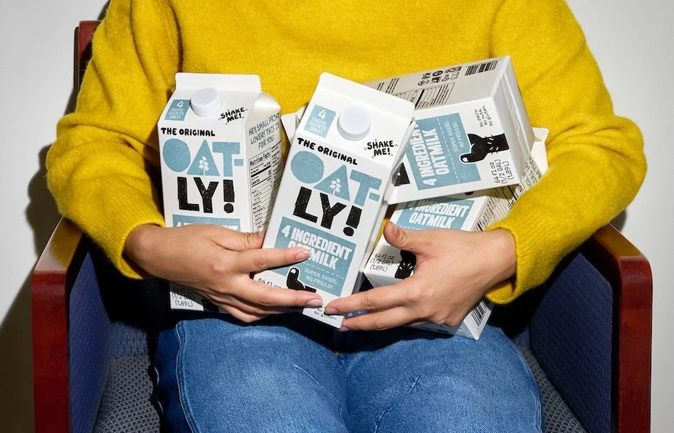
Case Study: Oatly Made “Different” Mean Something
Then there's Oatly.
Oatly is one of the best contemporary examples of what happens when verbal identity and visual identity stop behaving like separate departments.
Instead of looking like another polished health-food product, Oatly developed a deliberately awkward, outspoken, conversational identity.
The packaging became part of the advertising.
Forsman & Bodenfors, the agency behind the transformation, describes the strategy very plainly: Oatly needed to move oat-based products from a niche category into a broader lifestyle choice, and because the media budget was limited, packaging had to work hard enough to attract attention and invite people to engage with the brand.
That is strategic design.
The packaging wasn't merely trying to look different.
It was performing a job.
And the job was attention.
Academic analysis of Oatly's branding has similarly identified its packaging, color system, visual language, and poster campaigns as part of a broader semiotic strategy around authenticity, ethics, and sustainability.
The lesson isn't:
“Make your brand weird.”
Please don't.
The lesson is:
Make your brand's personality visible.
Oatly's unconventional visual and verbal identity works because it is connected to a clear worldview.
Without the worldview, the weirdness would just be weird.
Your Brand Doesn't Need to Be Loud
This is where the conversation around differentiation often goes sideways.
Founders hear:
“You need to stand out.”
And translate it into:
“Make everything louder.”
Suddenly the brand has:
Three typefaces.
Seven colors.
A bizarre mascot.
A dozen graphic devices.
An Instagram feed that looks like it drank six energy drinks.
That's not differentiation.
That's visual indigestion.
Distinctiveness does not require visual chaos.
Aesop is distinctive because of restraint.
Jacquemus is distinctive because of its visual world.
Oatly is distinctive because of its voice and attitude.
Different strategies.
Same principle:
Something recognizable about the brand beyond its name.
The Real Problem: Category Aesthetics
One of the easiest ways to make your brand disappear is to design exactly how your category expects you to design.
Luxury skincare?
Beige.
Serif.
Botanical photography.
Wellness?
Muted green.
Organic shapes.
Soft language.
Luxury fashion?
Black.
White.
Editorial photography.
Premium food?
Cream.
Gold.
Elegant typography.
You see the problem.
These design decisions aren't inherently bad.
They're just category codes.
And category codes help communicate what kind of business you are.
But if you rely on them entirely, you become visually interchangeable.
Your customer sees:
“Luxury skincare.”
But not:
“That luxury skincare brand.”
That's the gap.
Strategy Comes Before the Moodboard
This is why I don't believe the first step in a serious branding project should be opening Pinterest.
Pinterest is excellent at answering:
“What do I like?”
It is much less useful at answering:
“What should my brand own?”
Before selecting colors or typefaces, you need to understand:
Who are you trying to attract?
What do they already believe?
What are competitors communicating?
What category conventions should you follow?
Which ones should you challenge?
What emotional territory can your brand credibly occupy?
What should customers immediately understand?
And, perhaps most importantly:
What should they remember?
That's where brand strategy becomes useful.
The visual identity is the expression of those decisions.
Not the replacement for them.
Stop Asking “What Looks Good?”
Instead of:
“Which logo do you like?”
Ask:
“Which logo supports the position we're trying to own?”
Instead of:
“Should we use beige?”
Ask:
“What should our color system communicate—and which colors are already overused in our category?”
Instead of:
“Does this Instagram post look premium?”
Ask:
“Would someone recognize this post if our logo were removed?”
Instead of:
“Is this trendy?”
Ask:
“Will this still communicate who we are three years from now?”
Those questions produce better brands.
Because they're forcing design to solve a business problem.
The Difference Between Aesthetic and Identity
Here's the simplest way I know to explain it.
An aesthetic is a collection of visual characteristics.
An identity is a recognizable system.
Aesthetic:
“We like modern, sophisticated, editorial design.”
Identity:
“This is how our brand consistently expresses sophistication in typography, photography, color, composition, language, packaging, and experience.”
The first gives you inspiration.
The second gives you direction.
And direction is what allows a brand to scale.
Your Brand Should Be Recognizable Without Its Logo
This is the test I'd give almost every founder.
Take your logo away.
Now remove your company name.
Show someone your:
Website.
Instagram post.
Packaging.
Advertisement.
Business card.
Product photography.
Can they still reasonably guess that all of these belong to the same brand?
If not, you may have a logo.
You may even have beautiful design.
But you don't yet have a sufficiently strong visual identity system.
And that distinction matters.
Because logos appear in predictable places.
Brand recognition happens everywhere else.
Pretty Is the Starting Point—Not the Strategy
There is absolutely nothing wrong with wanting a beautiful brand.
You should.
Good design creates attraction.
It creates desire.
It communicates quality.
It can make a business feel credible and established.
But beauty should be doing more than decorating the strategy.
It should be carrying it.
The strongest brands use design to make positioning visible.
They use visual identity to create recognition.
They use distinctive assets to build memory.
They use consistency to reinforce meaning.
And they use creativity to give customers something worth remembering.
That's the difference between a brand that gets compliments…
…and a brand that gets chosen.
The Brand Designer's Job Isn't to Make You Look Good
It's to make you make sense.
To your audience.
In your category.
At your price point.
Against your competitors.
Across every touchpoint.
And eventually, inside someone's memory.
Because the goal of branding isn't:
“Wow, that's pretty.”
It's:
“I know exactly who that is.”
That's when design starts creating commercial value.
And that's when your brand stops being another beautiful business on the internet.
It becomes recognizable.
Memorable.
Distinctive.
And, most importantly, chosen.