
Designing Delicious: Turning Your Bakery’s Flavor into a Visual Identity
Introduction: Branding You Can Taste
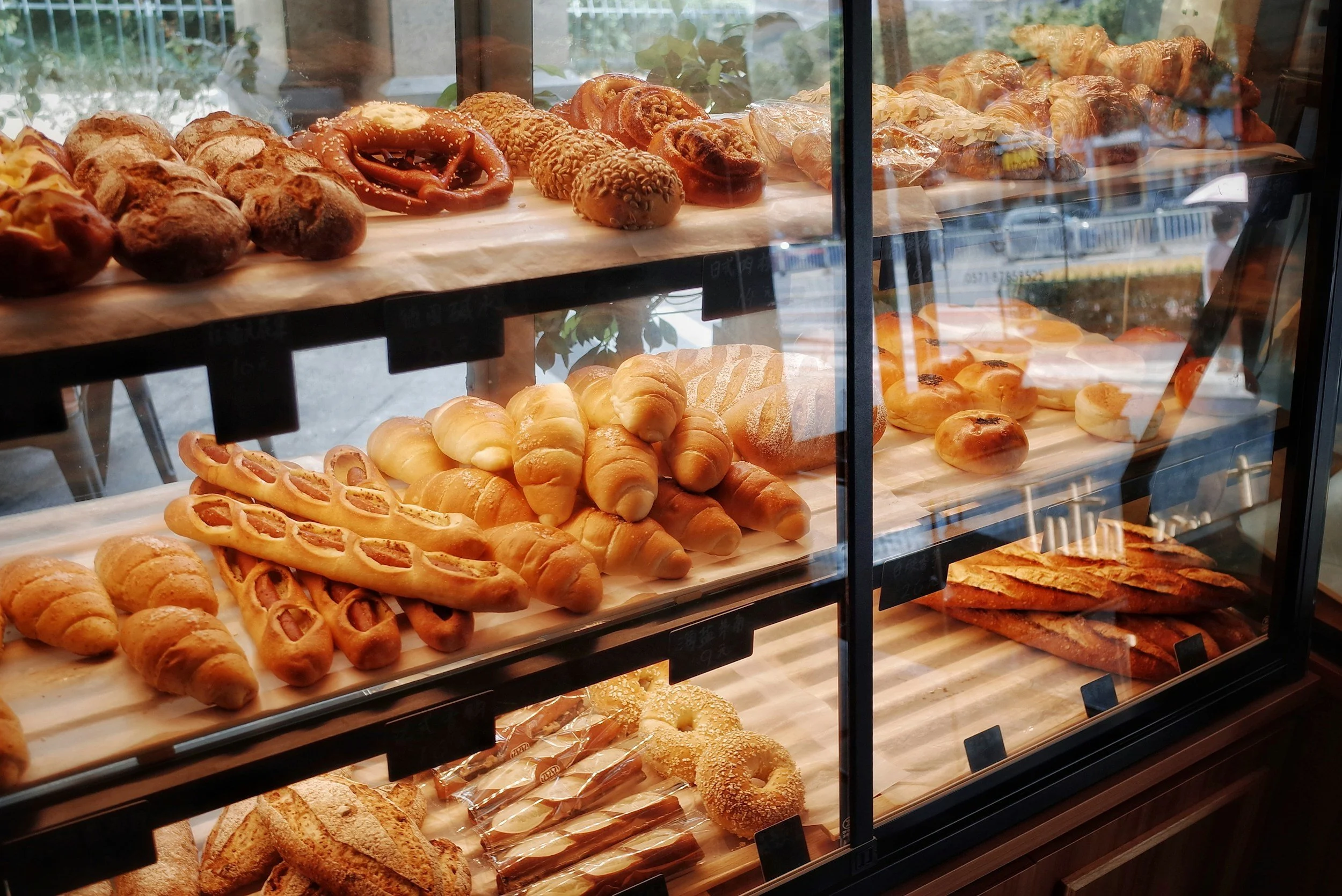
Walk into a great bakery and you feel it before you order.
The smell of butter and sugar. The warmth of the space. The anticipation as pastries gleam behind glass.
That feeling? That’s branding.
Bakeries thrive on emotion and sensory memory more than almost any other business. Taste gets customers in the door once—but identity is what brings them back, tells them this is my place. Yet many bakeries suffer from a strange disconnect: incredible products wrapped in forgettable visuals. Amazing croissants… generic logos. Handcrafted bread… stock packaging.
As branding expert Marty Neumeier famously said, “Your brand isn’t what you say it is. It’s what they say it is.”
If your visuals don’t echo what customers taste, smell, and feel, you’re leaving loyalty—and money—on the table.
This article explores how bakeries can translate flavor into form, creating a visual identity that tastes as good as the product itself.
Know Your Signature Flavor (Brand Positioning)
Before colors, logos, or packaging, you need clarity. Not on what you sell—but what you stand for.
Every bakery has a signature flavor profile, even if they’ve never named it:
Rustic & honest (handmade, imperfect, soulful)
Playful & nostalgic (sprinkles, fun names, childhood joy)
Elegant & refined (precision, luxury, restraint)
Indulgent & decadent (rich, dramatic, unapologetic)
Flavor is personality.
Chad Robertson of Tartine Bakery built a global brand around the idea of craft and patience. He once said, “Good bread takes time. There’s no way around it.”
That philosophy shows up everywhere in Tartine’s identity—from its understated wordmark to its earthy interiors and tactile packaging. Nothing shouts. Everything whispers confidence.
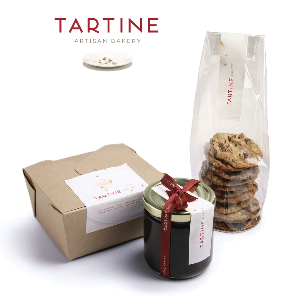
Case Study: Tartine Bakery
Tartine is famed for its artisanal sourdough, so the brand refresh leaned into that heritage. Designers chose very simple, earthy packaging – a plain kraft bread box and a glass jam jar with a handcrafted label – and even a crumb motif to hint at texture. The label reads “Tartine – Artisan Bakery,” tying the language directly to its rustic roots. In the new identity, the logo and boxes are almost monochrome, letting the real bread and pastries (and the name Tartine, French for “slice”) stand out.
Defining your positioning goes beyond visuals, too. Your USP (unique selling proposition) and taglines should echo the same theme. The Retail Bakers of America suggests crafting a concise tagline that captures your bakery’s essence. Joanne Chang of Flour Bakery, for instance, uses the slogan “Baking with Love”, directly communicating her commitment to quality and care. Think of your bakery’s mission in one sentence: it becomes the throughline that guides your design decisions. When customers see your logo or hear your shop name, they should immediately get a feel for what your bakery tastes like – in their mind’s palate
Takeaway:
If your bakery were a person at a dinner party, who would it be? That answer should guide every design decision.
Visual Elements Inspired by Taste
Color Psychology for Flavor Profiles
Color is often the first “taste” a customer experiences—and it shapes expectations fast.
Research from the Journal of Sensory Studies shows that color can significantly influence perceived sweetness, richness, and freshness. Soft creams and warm browns suggest comfort and butteriness. Deep jewel tones hint at indulgence and luxury. Pastels feel light, delicate, and romantic.
Texture as a Branding Device
Texture matters more than most bakers realize.
Matte, uncoated packaging feels handmade, organic, honest.
Glossy finishes and foils signal refinement and indulgence.
Embossing or letterpress adds tactility—design you can feel.
Your packaging should feel like your pastries taste.
Typography That Matches Experience
Typography is flavor in letterform.
Script and calligraphy = romance and delicacy
Bold sans-serifs = confidence and modernity
Classic serifs = tradition and craftsmanship
Case Study: Ladurée
The legendary French patisserie Ladurée is a perfect illustration. Its Paris salons are dripping in mint-green and pastel pink, crowned with gilt accents and vintage Rococo flourishes. The result: a “garden of delights” ambiance of softness and romance. As leadership explains, they deliberately preserved their “soft pastel palette” in every new location. Just as Ladurée’s macarons are airy and dreamy, their visual identity evokes the same feelings even before a taste.
As Ladurée CEO Julien Alvarez noted in interviews, the brand’s goal is to make every visit feel like “a moment suspended in sweetness.” The design does exactly that.
packaging as the First Bite
Packaging is not an afterthought—it’s the appetizer.
A WestRock study found that 72% of consumers say packaging design influences purchasing decisions, especially in food. In bakeries, packaging often becomes a traveling billboard—carried through streets, offices, and social media feeds.
Great bakery packaging:
Protects the product
Enhances perceived value
Creates a moment worth sharing
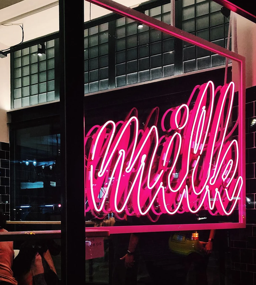
Case Study: Milk Bar
Christina Tosi’s cult-favorite Milk Bar shows the power of playful packaging. The brand’s reimagining channels a New York bodega vibe with electric pinks, blues, and street-art graphics on its boxes and bags. As brand consultants explain, Milk Bar’s identity became a “bodega dessert lab” – think convenience-store brightness and whimsy. Their cookie and cake boxes are intentionally loud and fun, reflecting the bakery’s quirky “compost cookie” and cereal-milk flavors. In short, the packaging itself looks as creative as what’s inside.
The packaging looks how the treats taste: loud, nostalgic, and joyfully unpolished. That clarity helped Milk Bar become one of the most Instagrammed bakeries in the world.
Takeaway:
If your box doesn’t make people pause before opening it, you’re missing a branding opportunity.
Interior Atmosphere + Customer Experience
Your space is part of your identity—even if it’s small.
Lighting, layout, materials, and signage all reinforce brand messaging. A minimalist patisserie with surgical lighting communicates precision. A warm, crowded bakery with wood shelves communicates abundance and comfort.
And yes—photo-worthiness matters.
According to Forbes, user-generated content is one of the most trusted forms of marketing. A visually distinct bakery turns customers into brand ambassadors without asking.

Case Study: Dominique Ansel Bakery
Dominique Ansel’s spaces emphasize storytelling and innovation—open kitchens, visible processes, and clear narratives behind each product. Ansel has said, “Dessert should tell a story, not just satisfy a craving.”
The Cronut wasn’t just a pastry; it was an experience. And the bakery’s design made that story visible.
As Dominique Ansel reminds us, the goal is to be memorable in the heart – not just on camera. In practical terms, you can start today by identifying three core adjectives for your bakery (e.g. “joyful,” “rustic,” “elegant”) and making sure each design choice – from logo and colors to the font on your menu – reflects one of them. Aligning design and flavor creates a cohesive, irresistible brand that customers will crave seeing and tasting.
Let Story Do the Heavy Lifting
Great branding doesn’t shout—it explains why you exist.
Your story might be:
Generational heritage
Obsessive craftsmanship
Playful rebellion against tradition
A love letter to nostalgia
Whatever it is, consistency is key.
Menu names, copy tone, signage, and social captions should all sound like the same voice. Calling a croissant “Butter No. 27” versus “Classic Croissant” sends very different signals.
As branding consultant Debbie Millman puts it, “Design is the silent ambassador of your brand.” Story gives that ambassador something meaningful to say.
Digital Presence That Feels Like Dessert
If your Instagram doesn’t taste like your bakery, something’s off.
Your digital presence should extend the in-store experience:
Warm brands = warm lighting, natural tones
Luxury brands = restraint, spacing, editorial layouts
Playful brands = movement, humor, bold composition
From website UX to seasonal campaigns, cohesion builds trust. Inconsistency creates doubt.
A beautiful bakery with a dated website is like serving a perfect tart on a chipped plate.
When Branding Meets Appetite
The most successful bakeries understand one truth:
DESIGN AND FLAVOR MUST BE REUNITED!!!
When visuals reflect taste, craftsmanship, and emotion, customers don’t just buy pastries—they buy into a feeling. Loyalty forms before the first bite.
Where to start:
Define your signature flavor personality
Audit your visuals for alignment
Invest in packaging and space as experience tools
Tell one clear, consistent story everywhere
Because when branding meets appetite, your bakery becomes unforgettable—and that’s the sweetest win of all.